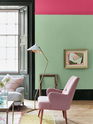
When designing an interior scheme, choosing complementary paint colours for your ceiling, woodwork, furniture and walls will enhance the finished space. Using colours that work in perfect harmony on all elements will add depth and character to your scheme. In turn, everything will appear coordinated and carefully considered.
Read our guide to choosing complementary paint colours, with tips and inspiration to help you combine colours with confidence…
What are complementary colours in interior design?
When we talk about ‘complementary colours’, this could relate to tonal colours based on the same pigment. Alternatively, ‘complementary colours’ could refer to contrasting shades that combine to create a beautiful colour balance. Red and green is a classic example of complementary colour contrast, coming from opposite sides of the colour wheel.
Introducing complementary colours in your interior designs - rather than one colour throughout - creates visual interest, adding depth and character. You could incorporate a colour highlight to provide a focal point on your skirting boards, for example. Or paint your ceiling in a lighter colour related to your walls to offer a touch of contrast.
Visit the product page for your chosen Little Greene colour to see our recommended colour pairings. You will find a selection of complementary whites, neutrals and colours, as well as contrasting accents and related dark shades. These recommendations make the process of finding complementary colours a truly effortless task. Or order the Little Book of Colour to browse complementary colour pairings for every shade in the palette.
How to use complementary paint colours for your home décor
From soft tonal pairings to bolder contrasts, there are complementary colour combinations to suit every interior style. Discover inspiring ideas to incorporate complementary paint colours in ways that will elevate your schemes…

Use the Colour Scales for a harmonious look
For a simple way to combine colours, explore the Little Greene Colour Scales. Each column provides a selection of six paint colours which you can combine with confidence. Use these shades on your walls, woodwork, ceilings, cabinetry and more, creating a beautifully coordinated interior. You can introduce lighter and darker shades throughout your space to softly define interior features and add depth to your scheme.

The Masquerade Colour Scales are a family of alluring powder pinks. You can utilise these pinks on different parts of your living space to create a serene, inviting setting. Or pair the gentle blue-grey, Obscura, with Juniper Ash to instil calm and focus in your home study.

Introduce a bold colour highlight within a tonal scheme
Comprising 18 families of related colours, the Colour Scales colour card gives you the tools to introduce bolder shades. These bolder hues are the perfect choice for creating an interesting focal point. Choose a selection of neutrals from the Stone palette to provide a soft, sophisticated backdrop. Then incorporate a complementary dark or vibrant colour on one piece of cabinetry or furniture.

The deep, sumptuous red, Arras, adds enticing richness to a scheme of Ferdinand, Castell Pink and Nether Red. Or introduce a playful element in a Green Stone nursery scheme. You can do so by painting a piece of furniture in the vibrant green, Hopper.

Embrace a contemporary twist on pink and green
Pink and green is a natural combination, reminiscent of the harmonious relationship between flowers and greenery. The traditional pairing of a natural green and light pink provides gentleness and tranquillity. But you can also bring a contemporary twist by incorporating unique, unexpected pink and green shades.
Add impact to Pea Green walls with the statement bright pink, Leather. Introduce Obsidian Green on the skirting boards and panelling to frame this striking colour pairing.

For something softer, Tracery II offers an elegant accompaniment to Light Beauvais. These sophisticated, pastel shades are ideally suited to a quiet, peaceful space. Consider incorporating these gentle pink and green hues into spaces such as your bedroom, dressing room, or home study.

Pair red and green for a classic contrast
Red and green is another tried and tested colour combination. These shades are on opposite sides of the colour wheel to provide a confident contrast. This pairing will fill your scheme with personality, creating an engaging and inviting atmosphere. Therefore, red and green are ideal for high-traffic, energetic spaces like kitchens, utilities and boot rooms.
Consider the playful combination of Pleat and Heat for your boot room, hallway or porch. Utilising these colours is ideal for welcoming guests from the outside into a warm and colourful retreat.

For a homely kitchen setting, a richer, more muted combination will work well. Consider pairing Windmill Lane with the purple-red, Cordoba, to achieve a cosy atmosphere. These elegant hues provide a soothing backdrop for natural stone, brick and wood finishes.

Use blue and yellow for a vibrant combination
Blue and yellow is another inviting, complementary colour pairing. Depending on the shades used, this colour combination can have a charming, traditional feel. Or certain blues and yellows can appear striking and contemporary.
Use the confident mid-blue, Air Force Blue, alongside warm yellows, Carys and Light Gold. Doing so will create a joyful living space that’s redolent of the sun in the sky.

For an impactful, contemporary finish, incorporate vibrant blues and yellows such as Mazarine and Yellow-Pink. By embracing each of these shades across a large expanse, you will make them both appear more vivid and intense. This colour pairing creates a captivating backdrop for a multi-functional exterior space perfect for socialising and entertaining friends.
Order your free colour card to explore complementary paint colours. Or consider our Colour Consultancy service to help you combine colour with confidence.

